Wednesday 5 May 2010
Monday 3 May 2010


Wednesday 31 March 2010
Question 3
The main thing we all wanted out of the project was for all the tasks to look professional and at a high standard. Overall, it would have to look like something which you would expect to see in the music industry.
The best way for us to get the correct information, was through feedback from different sources. We regularly asked our teacher for guidance and used her opinion to our advantage. As a result, we found that many times we changed our idea and this enhance the professionalism of our video.
The rough cut was the perfect way for us to get feedback before editing the final video. Our media class were enthusiastic about helping us, so we showed the rough cut to them. The main part which kept coming up was that the beginning of the video was a little too slow according to the rhythm and beat of the music. In order for us to be successful, they suggested that we made it something like the end which was faster paced.
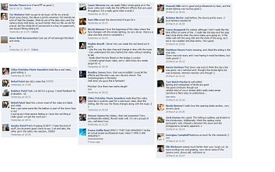
Each of us then uploaded our video onto our Facebook accounts so that we would have a wide range of audiences looking at the video. In return, we got a lot of feedback on their thoughts.
Most of the feedback was positive and it seemed that our hard work had payed off. They seemed so be pleased with the camera work which we produced and that the editing allowed the storyline to be easy to follow. The main part which I felt they like the most was the “Sin City” effect which we gave on some of the clips. This is where most of the shot would be in black and white and we had one or two thinking standing out in red. Another aspect which they enjoyed was the scary clown mask which we had used, as they felt that it really caught their attention as to what he was doing. The chair scene which we used during the chorus was a popular favourite as it fitted in very well with the music and yet it did not get too boring for them to watch.
There were however a couple of negative comments which were given to us. The first one was about the filming in London, as they thought it was not really relevant to the storyline and perhaps we could have included something else. The second one was about the makeup scene in the bathroom. They felt that it was too much light compared to the rest of the video. Perhaps that by shooting it in a darker area, which could be spookier would have been better.
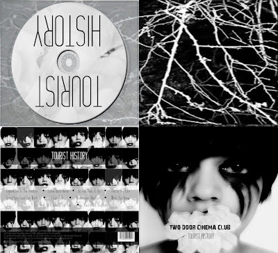
Hennie printed off the digipak for people to review on and annotate with their thoughts and comments. Many people liked the images as they thought it looked excellent and the font matched really well. One person said they like how the flower is covering the girls mouth as it "implies she is being silenced".
A few negatives was that the copyright information was a little difficult to see. So that maybe the brightness needed to be changed in order to make it more clear.
Hennie also printed off the website for some people to review and many people enjoyed the information on the band so that they knew more about who they were, They felt that it was interesting without being too much for them to read. The links were helpful as they could find out more if they wanted to.
The only criticism was that the information on the magazine advertisement was a little difficult for them to read, and they felt it was a little blurry.

The best way for us to get the correct information, was through feedback from different sources. We regularly asked our teacher for guidance and used her opinion to our advantage. As a result, we found that many times we changed our idea and this enhance the professionalism of our video.
The rough cut was the perfect way for us to get feedback before editing the final video. Our media class were enthusiastic about helping us, so we showed the rough cut to them. The main part which kept coming up was that the beginning of the video was a little too slow according to the rhythm and beat of the music. In order for us to be successful, they suggested that we made it something like the end which was faster paced.
Each of us then uploaded our video onto our Facebook accounts so that we would have a wide range of audiences looking at the video. In return, we got a lot of feedback on their thoughts.
Most of the feedback was positive and it seemed that our hard work had payed off. They seemed so be pleased with the camera work which we produced and that the editing allowed the storyline to be easy to follow. The main part which I felt they like the most was the “Sin City” effect which we gave on some of the clips. This is where most of the shot would be in black and white and we had one or two thinking standing out in red. Another aspect which they enjoyed was the scary clown mask which we had used, as they felt that it really caught their attention as to what he was doing. The chair scene which we used during the chorus was a popular favourite as it fitted in very well with the music and yet it did not get too boring for them to watch.
There were however a couple of negative comments which were given to us. The first one was about the filming in London, as they thought it was not really relevant to the storyline and perhaps we could have included something else. The second one was about the makeup scene in the bathroom. They felt that it was too much light compared to the rest of the video. Perhaps that by shooting it in a darker area, which could be spookier would have been better.

Hennie printed off the digipak for people to review on and annotate with their thoughts and comments. Many people liked the images as they thought it looked excellent and the font matched really well. One person said they like how the flower is covering the girls mouth as it "implies she is being silenced".
A few negatives was that the copyright information was a little difficult to see. So that maybe the brightness needed to be changed in order to make it more clear.

Hennie also printed off the website for some people to review and many people enjoyed the information on the band so that they knew more about who they were, They felt that it was interesting without being too much for them to read. The links were helpful as they could find out more if they wanted to.
The only criticism was that the information on the magazine advertisement was a little difficult for them to read, and they felt it was a little blurry.

Back Cover
It was difficult for us to find many examples of back covers, but they usually consist of the tack list and copyright details.
Georgina used a greyscale photo and a colour photo for her back covers. The third one she used was a montage of all the pictures she had. These are also those which are very similar in the video. She changed the transparency so that the text can be seen ontop.
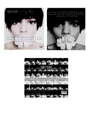
Georgina used a greyscale photo and a colour photo for her back covers. The third one she used was a montage of all the pictures she had. These are also those which are very similar in the video. She changed the transparency so that the text can be seen ontop.

Subscribe to:
Posts (Atom)